Design tokens: the grammar of your Design System
In most applications, changing something as simple as a color or the size of a spacing can become a nightmare, forcing you to go back and update all your components. Why? Perhaps because you’re not using tokens, or because they’re poorly structured. Yes, despite what skeptics might say, CSS—like everything else—requires immense precision.
Tokens are the foundation of a Design System, long before components. Each token represents a single choice: color, spacing, typography, etc. These tokens are then used to determine the style of the Design System’s components, which are in turn used in various applications.
Let’s take a closer look.
Step 1: Defining tokens
This stage has nothing to do with code, as it’s purely graphic design work. We generally define two or three layers of tokens. Each layer defines base tokens and builds upon the tokens in the layer below it, if there is one.
For educational purposes, we’ll use animation duration as an example—a simple aspect to work with. The following applies equally to colors, spacing, and typography.
-
Primitives layer: In our example, these are the tokens
--primitive-duration-100: 100;to--primitive-duration-1000: 1000;, whose values form an arithmetic sequence ranging from 100 to 1,000. At this stage, the goal is to limit the number of possible values (10 versus an infinite number) and to set their relative intervals (arithmetic sequence, geometric sequence, etc.). The primitives layer therefore plays an essential role in accessibility (contrast). However, the values have no unit—the system layer will specify the unit based on how they are used. -
System Layer: The tokens it defines tell us how they will be used within components. It is therefore a semantic layer, which also introduces units. Example:
--system-transition-duration-fast: calc(var(--primitive-duration-300) * 1ms);. A lot is happening here: 1. A new restriction—we’re going from 10 to just 2 possible values; 2. The introduction of slow/fast semantics and a unit (milliseconds), which is part of these semantics; 3. The use of tokens from the primitives layer, since the system layer should not define raw values itself. -
Component Layer: This layer is optional, since tokens from the system layer can be used directly within components without ambiguity. However, some organizations choose to define tokens such as
--component-button-transition-duration-fast: var(--system-transition-duration-fast);—that is, tokens specific to each component, prefixed with the component’s name. To me, this seems of questionable value and may even run counter to the systematic nature of the lower layer. On the other hand, a few tokens of this nature are sometimes useful for explicitly indicating a coupling between several components (a typical example:--component-height-header).
The primitives layer defines a number of tokens that the system layer does not use (8 out of 10 in this example). Is this a waste? No. The unused tokens define the universe of possibilities—the closed set of values on which the system layer can rely. These values maintain a very specific relationship with one another, which choosing an arbitrary value would only break. The key point, therefore, is change: if the value --primitive-duration-300 is no longer desired, that doesn’t mean we simply switch to --primitive-duration-350. This approach deliberately goes against the YAGNI (You Aren’t Gonna Need It) principle, because it ensures consistency.
Furthermore, the naming of tokens is of particular importance. Take font families as an example: --primitive-font-family-serif is suitable for a token at the primitive layer, because the name reflects the value. --system-font-family-title is suitable for a token at the system layer, because the name reflects its usage across various components (such as <H1 /> and <H2 />, but not within a specific component).
/* ------------------------ */
/* Primitive tokens         */
/* ------------------------ */

/* Font family */
--primitive-font-family-sans-serif:
  Roboto, Verdana, "Helvetica Neue", sans-serif;
--primitive-font-family-serif: Georgia, serif;
--primitive-font-family-mono: Courrier New, mono;

/* ------------------------ */
/* System tokens            */
/* ------------------------ */

/* Font family */
--system-font-family-base: var(--primitive-font-family-sans-serif);
--system-font-family-title: var(--primitive-font-family-sans-serif);
In contrast, the following names would be problematic:
--system-font-family-serif: a token in the system layer should not describe its value, since it could change;--system-title-font-family: Here, we’re not talking about the font used for headings in general, but rather the font used in the<Title />component. So this is actually a token from the component layer—let’s not dismiss it out of hand.
This example is completely unambiguous, but other aspects sometimes raise… philosophical questions 😱
Defining these tokens is by far the most foundational and challenging step. In practice, the process is rarely a strictly bottom-up approach primitive layer → system → components. There’s frequent back-and-forth, and sometimes we start with existing mockups to rebuild a Design System and bring a sense of rationality to it.
Once this work is done, the next step is to translate the tokens into code that the components can use.
Step 2: Translating tokens into CSS variables
I find it convenient to define tokens directly in CSS (even for a designer) because it makes the calculation formulas explicit. But some people prefer to define them in a design tool like Figma. In any case, at some point, you’ll need to port them to CSS—and pure CSS at that: no libraries or CSS frameworks at this stage.
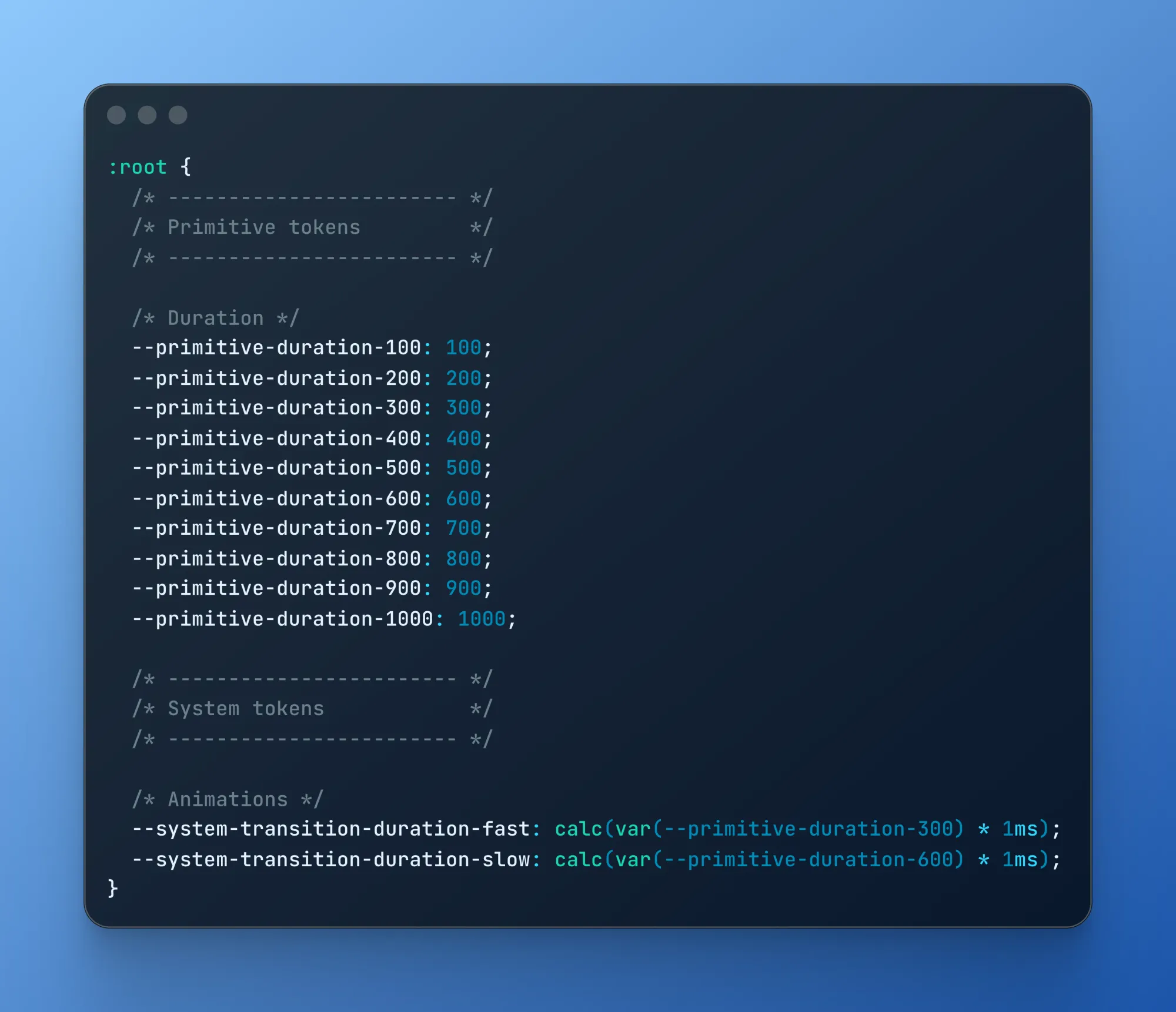
Let’s recap:
:root {
  /* ------------------------ */
  /* Primitive tokens         */
  /* ------------------------ */

  /* Duration */
  --primitive-duration-100: 100;
  --primitive-duration-200: 200;
  --primitive-duration-300: 300;
  --primitive-duration-400: 400;
  --primitive-duration-500: 500;
  --primitive-duration-600: 600;
  --primitive-duration-700: 700;
  --primitive-duration-800: 800;
  --primitive-duration-900: 900;
  --primitive-duration-1000: 1000;

  /* ------------------------ */
  /* System tokens            */
  /* ------------------------ */

  /* Animations */
  --system-transition-duration-fast: calc(var(--primitive-duration-300) * 1ms);
  --system-transition-duration-slow: calc(var(--primitive-duration-600) * 1ms);
}
I mentioned calculation formulas earlier. Here are two examples:
- Defining a size scale based on powers of 2:
/* ------------------------ */
/* Primitive tokens         */
/* ------------------------ */

/* Size */
--size-power: 2;
--primitive-size-1: 1;
--primitive-size-2: calc(var(--primitive-size-1) * var(--size-power));
--primitive-size-3: calc(var(--primitive-size-2) * var(--size-power));
--primitive-size-4: calc(var(--primitive-size-3) * var(--size-power));
--primitive-size-5: calc(var(--primitive-size-4) * var(--size-power));
--primitive-size-6: calc(var(--primitive-size-5) * var(--size-power));
--primitive-size-7: calc(var(--primitive-size-6) * var(--size-power));
--primitive-size-8: calc(var(--primitive-size-7) * var(--size-power));
--primitive-size-9: calc(var(--primitive-size-8) * var(--size-power));
--primitive-size-10: calc(var(--primitive-size-9) * var(--size-power));- Defining a fluid typographic scale (my goal is not to explain the calculations but rather to show that this complexity justifies the formalization of a system layer, for any reader who might doubt it):
/* ------------------------ */
/* System tokens            */
/* ------------------------ */

--system-font-size-growth-h1: calc(
  (
      var(--primitive-font-size-desktop-2xl) -
        var(--primitive-font-size-mobile-2xl)
    ) /
    (
      var(--primitive-viewport-growth-stop) -
        var(--primitive-viewport-growth-start)
    )
);
--system-font-size-h1: clamp(
  calc(var(--primitive-font-size-mobile-2xl) / var(--1rem-in-px) * 1rem),
  calc(
    (
        var(--primitive-font-size-mobile-2xl) -
          var(--system-font-size-growth-h1) *
          var(--primitive-viewport-growth-start)
      ) /
      var(--1rem-in-px) * 1rem + var(--system-font-size-growth-h1) * 100vw
  ),
  calc(var(--primitive-font-size-desktop-2xl) / var(--1rem-in-px) * 1rem)
);
Step 3: Implementing a functiontoken()
The next step involves using the tokens from the system layer as CSS properties. We want to be able to call these properties from any component in the Design System while hiding this complexity. To do this, we define a function token that can be called as follows:
import React from "react";
import { token } from "../../../tokens";
import { join } from "../../../utils";

type Props = {
  children: React.ReactNode;
};

export const CallToActionButton: React.FC<Props> = ({ children }) => (
  <button
    className={join([
      // other tokens
      token("system-transition-duration-fast"),
    ])}
  >
    {children}
  </button>
);
To implement this feature, you can use vanilla CSS—something like { transition-duration: var(--system-transition-duration-fast) }—or use a CSS framework such as Tailwind. You would then write:
type AbstractToken = Readonly<{
  [key: string]: string;
}>;

const transitions = {
  "system-transition-duration-fast":
    "duration-(--system-transition-duration-fast)",
  "system-transition-duration-slow":
    "duration-(--system-transition-duration-slow)",
} satisfies AbstractToken;

export const tokens = {
  ...transitions,
  // Other dimensions
} satisfies AbstractToken;

export type Token = keyof typeof tokens;

export const token = (token: Token): string => tokens[token];
It is at this precise point in the implementation of the system layer that states such as:hover, and dark mode—if you wish to implement one—are typically handled:
const colors = {
  "system-border-color-brand":
    "border-(--system-border-color-brand-light) dark:border-(--system-border-color-brand-dark)",
} satisfies AbstractToken;
The benefit is that your components can simply call token("system-border-color-brand") without having to worry about dark mode—it’s all handled upstream!
An important point: here, we’re not using Tailwind’s ability to customize a theme. This is intentional: we don’t want to automatically generate all of Tailwind’s utility classes; rather, we aim to narrow down the range of possibilities to define a “lexicon” that can be used by the components.
Finally, when the day comes that your CSS framework no longer meets your needs, making the switch will be relatively easy since most of the change will involve implementing the token function.
Step 4: Using tokens in Design System components
Everything is now in place to use tokens within the Design System’s components.
At this point, I think it’s important to emphasize that no token—and certainly no CSS class or property—should “leave” the Design System. Your applications will simply assemble the predefined components of the Design System to form high-level screens—screens with an immediately recognizable visual style, in which the same graphic patterns are consistently used—what we refer to as “visual grammar.” This consistency is the key to an increasingly easy and enjoyable user experience—even if the user doesn’t necessarily notice it.
The fact that tokens can only be used within the Design System is a significant constraint. It requires a good linter, but above all, it requires that the Design System provide the necessary components for styling—ranging from atoms to templates, from a simple Stack to a complete PageLayout. It’s a substantial effort, but one that yields real benefits: any visual changes, if they’re needed, are concentrated in a single place—the Design System.
As is often the case, before thinking about “tools,” you’ll be better off thinking about “architecture.” It doesn’t matter whether you use Tailwind or one of its competitors, as long as the token architecture is in place.
A Design System is a real investment that can take weeks of work. But the ROI is real: properly implemented, the cost of making changes is independent of the application’s size. In fact, working in white-label mode simply means replacing one CSS file with another—no components need to be modified.